The Studio in 2010

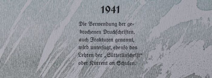
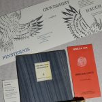
This year is all about the artist‘s book „Mir fehlt ein Wort“ (I am lacking a word), paying homage to Kurt Tucholsky 75 years after his death. He was an astute observer and remains a contemporary witness of the years that resulted in the Nazi regime in Germany, a power that swept across the whole of Europa and eventually plunging the rest of the world into a dreadful war. Tucholsky had a doctorate of Law and was thus perfectly positioned to point out mercilessly the lies and red herrings of the Nazis.
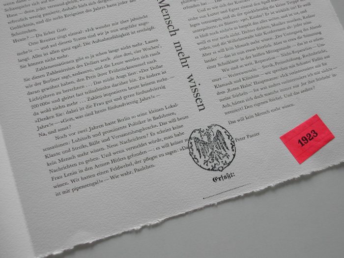
Some 60 of Tucholsky‘s writings are included in the artist‘s book, wrapped within a background story of a young printer named Wilhelm Klemper. This story is one part of the artist‘s book and is enclosed as a typewritten manuscript, researched and written by one Karl Kauz. This name refers to Tucholsky playing with pseudonyms. The story is fictional. Tucholsky being stripped of his citizenship in 1933 however, was real. The book asks the question: „Could it all have been like this?“ A joung printer collects spoils with texts he decides as interesting. In the hands of an extremist party, this collection instantly metamorphoses into evidence for political persecution.
In June the Grafix proof press arrives at the studio, transported on a low loading vehicle made for transporting an excavator. Strapped to the oversized lorry, the press looks like a miniature of itself. It will gradually develop into the heart and backbone of the studio. This press is fitted with an adjustable pressbed and motorised rollers, which makes it simply perfect for printing small size metal type. All of a sudden all the smaller sized typefaces become a usuable option for printing.
A colleague asks whether I would be ready to help re-home a special sort of metal type. The typeface, called Titula, was designed for private use by Alfred Finsterer and cast at Klingspor foundry. Finsterer used the typeface for his own projects, it was neither produced for, nor available on the open market. The designer had died a long time ago and his widow was elderly, so a new safe place for the type was needed. The load would be one type cabinet, and this sounds quite managable. The old Ford Transit van is experienced in transporting type cabinets and metal type, and so am I. While loading I am asked: „Don‘t you want to take these as well?“
First it is dozens of jars containing spacings, prior to containing spacings the jars had held canned herring. Then there are loads of standing matter stored on cardboard. It soon becomes obvious that I need reinforcement in the form of a second car and all the galleys the studio can supply in order to safely load the standing matter. In the end the private typeface Titula, consisting of capital letters only, and all the other items, arrive safe and sound at the studio. There are just the loads of standing matter that need to be distributed at a later time, meaning that the specimens still have to be sorted into their respective type cases.
For one day Sven Löffler and his assistant turn the studio into the set for a movie production. Sven is training as a media designer and as his final project he decides to produce a video on working with metal type and letterpress printing, giving a touch of Hollywood to my small studio in Swabian Waeschenbeuren.
The printing department of a school near Schorndorf is closing down. I am lucky in that I can pick up some more Optima typeface to add to what is already in stock. And from a former employee of the Weber foundry a number of typefaces designed by Georg Trump make their way into the collection at my studio.
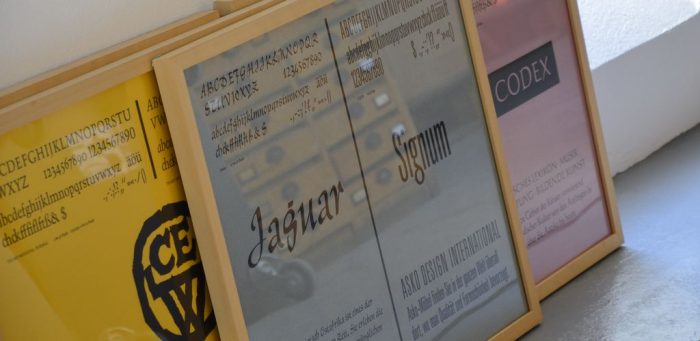
These are almost unused specimens since they had been part of the foundry‘s archive, amongst them TimeScript, Schadow and Jaguar. Apart from the metal type there is a type cabinet and a wooden cabinet for paper storage ready to be picked up as well. The wooden cabinet was already earmarked for the local tip, and inside, I find some of the foundry‘s very nice specimen posters.
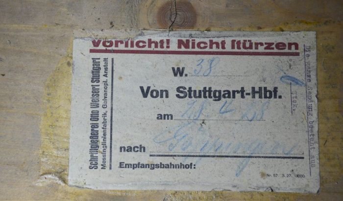
A printing office in Göppingen had been holding on to its letterpress department for some time, but now cabinets and type have to go. I doubt I can squeeze even more into my place, but, to my big surprise, and with a little reshuffling, more space can still be made for the new equipment. I can also pick up a very old type cabinet, which still carries its freight sticker from 1928.
This seasoned cabinet comes with two friendly bonded typefaces, one called Goethe-Antiqua and the other Schiller-Fraktur. Some letterpress people did have their own sense of humour.
Regrettably, shortly before I can go there to pick everything up, some of the metal type is thrown out into a zinc tub, and it cannot be helped but I‘ll have to take the tub as well and sort the type later.

Briefly noted:
Exhibiting at Frankfurt Bookfair, this is the first year without „Place of Book Art“, that had been organzied by Heinz-Stefan and Wiebke Bartkowiak for a very long time.
Collaboration in the international project of „Libro della Notte“, Venedig
Exhibiting at Druck&Buch in Erlangen
Exhibiting at Wasserschloss Klaffenbach near Chemnitz
The brand „Manufaktur Papiergebunden“ is coined, and „www.papiergebunde.de“ goes online
Published in 2010:
„Horizonte“ lino etching
„Portrait of a Friend“ lino etching, paying homage to Harald Goldhahn who died in late 2009
„Rucola – wer hat das gefunden?“ artist‘s book, with 21 linocuts, open spine binding
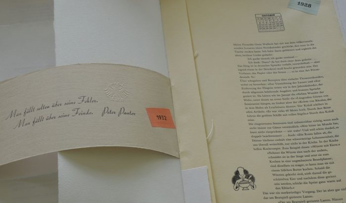
„Mir fehlt ein Wort“ artist‘s book on Kurt Tucholsky
Contact
for Druck&Buch in Erlangen alongside Poets Feast: Johannes Häfner

To be continued on 5 May 2024


Just lovely Annette. One day I would like to read more of Kurt Tucholsky’s works. I had to grin when I saw the little photo of dear van finally allowed to have a chilled-out rest.